Frilnce
Running a freelance business shouldn't feel like a second full-time job. Frilnce is an operations workspace designed for creative freelancers to manage clients, projects, invoices and daily priorities from one place.
↗ View Live Product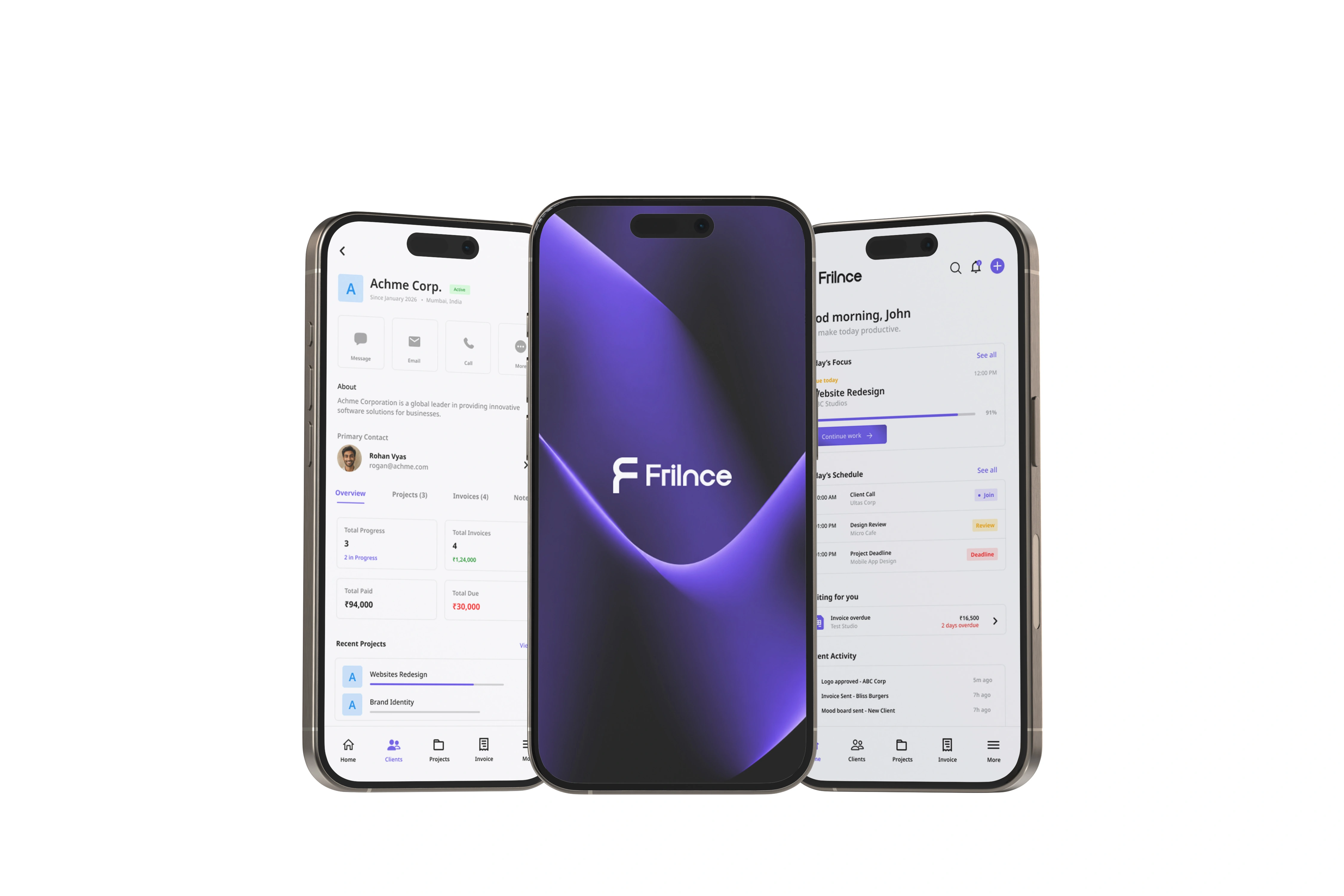
Freelancers don't struggle to do the work.
They struggle to manage everything around it.
Creative freelancers constantly switch between messaging apps, project management tools, invoices, calendars and cloud storage. Important information becomes fragmented, making it difficult to know what deserves attention next.
Users rarely forget tasks.
They forget where those tasks live.
Scattered Workflows
Projects, invoices and communication are spread across multiple tools.
Missed Follow-ups
Invoice reminders often happen after payments become overdue.
Decision Fatigue
Users spend the first part of every day figuring out where to begin.
No Closure
Most productivity tools never provide a satisfying end to the workday.
Understanding the opportunity.
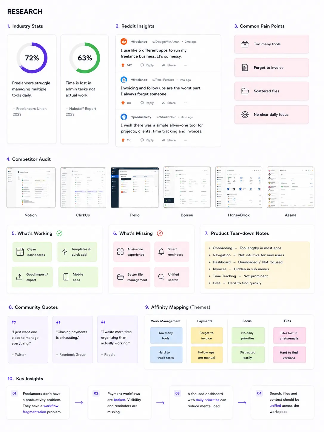
Since Frilnce is a concept project, the problem space was grounded through industry reports, competitor analysis, product teardowns, freelance communities and existing productivity tools rather than invented assumptions.
Industry Reports
Productivity reports helped identify recurring workflow challenges faced by freelancers.
Competitor Audit
Existing products were analysed to understand common patterns and missed opportunities.
Community Discussions
Reddit, X and freelance communities highlighted everyday operational frustrations.
Product Tear-down
Navigation, onboarding and dashboard experiences were compared across multiple apps.
Users rarely forget tasks.
They forget where those tasks live.
Late invoices aren't unusual.
Reminders should happen before payments become overdue.
Today's priority matters more than analytics.
People first want clarity on what deserves attention.
Designing for clarity,
not complexity.
Rather than building another feature-heavy productivity tool, Frilnce was designed around one simple idea: reducing decision making throughout the workday.
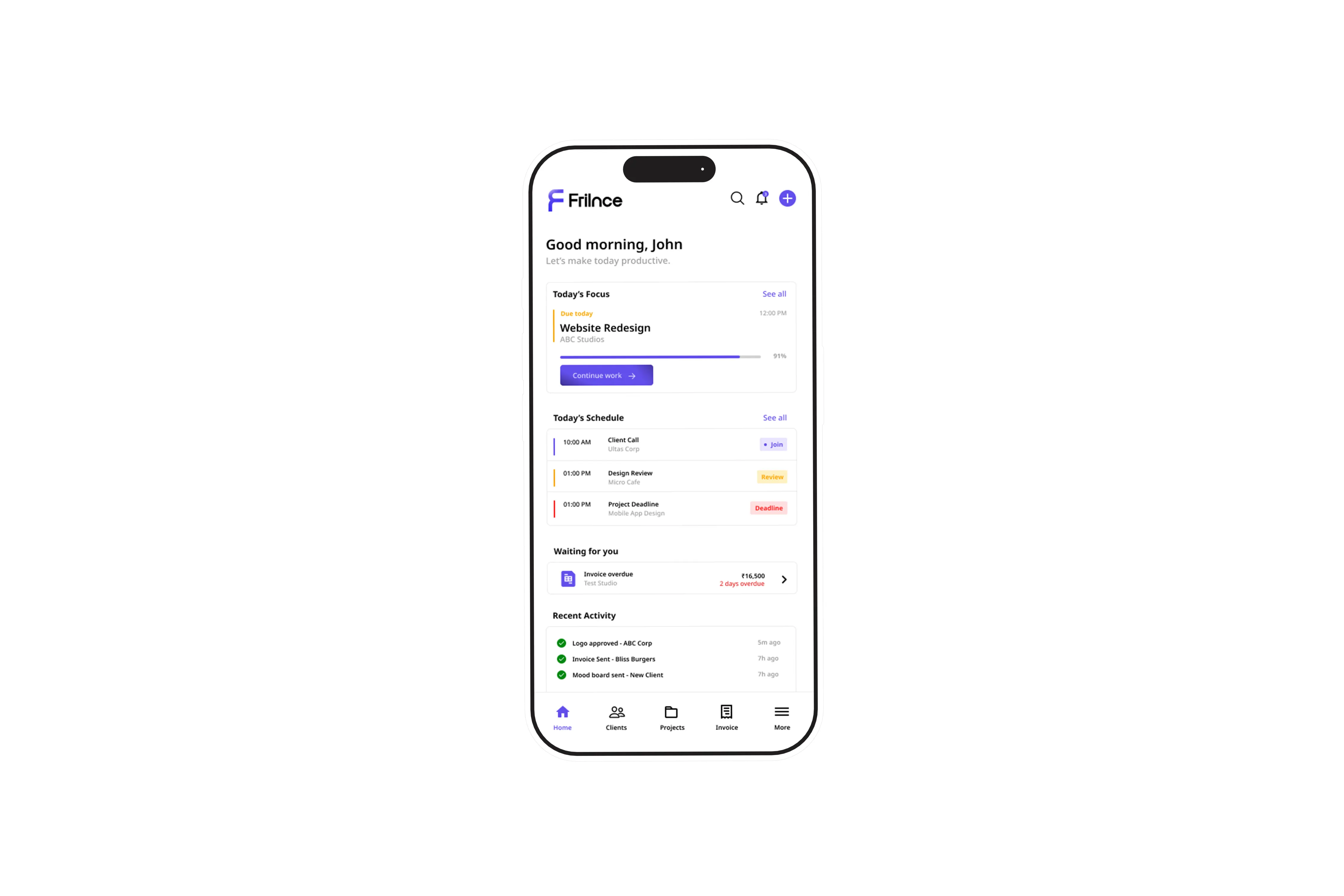
Prioritize today's work
The first screen should immediately answer one question: What should I work on right now?
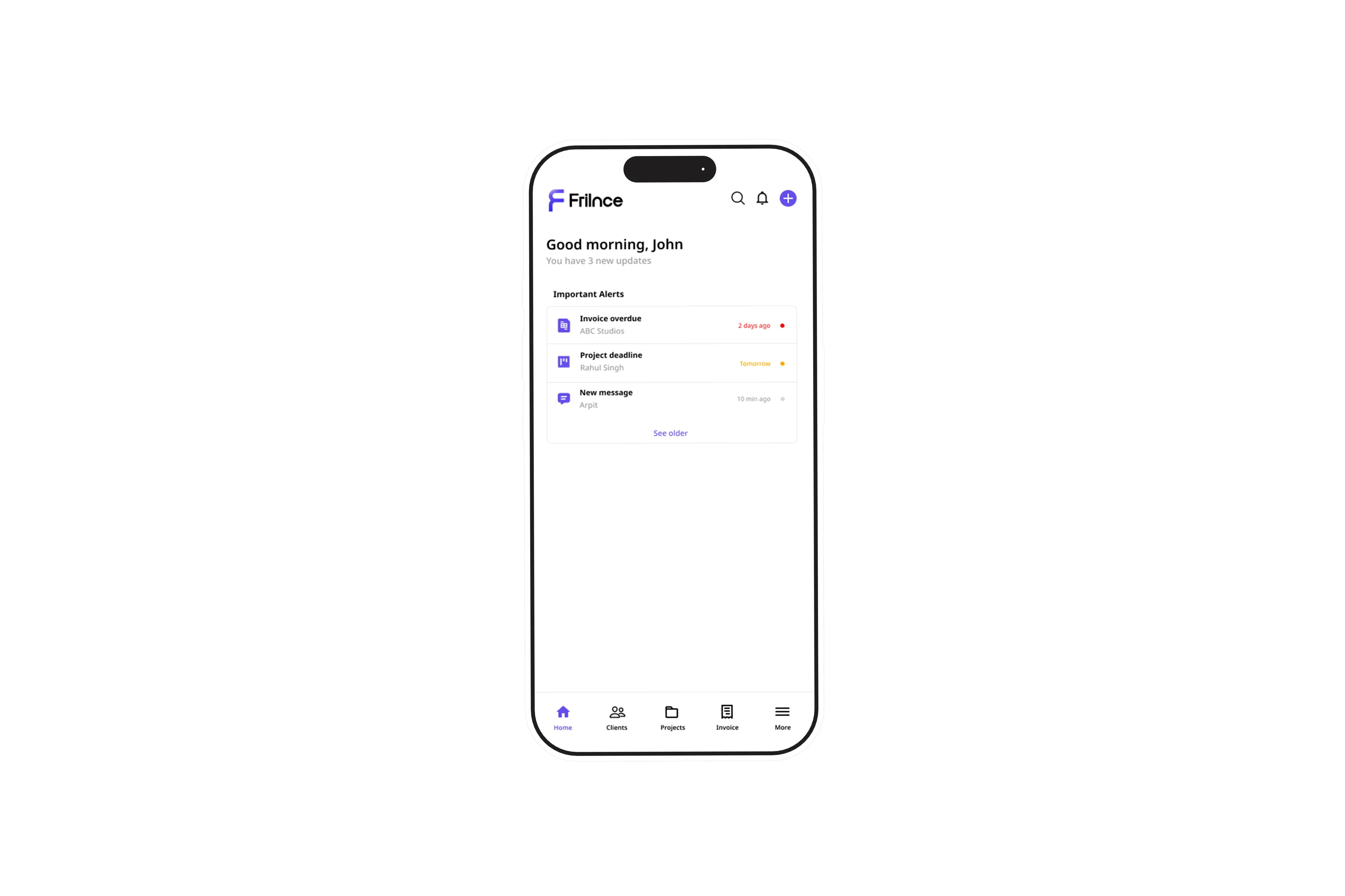
Surface important information
Overdue invoices, deadlines and urgent actions should appear automatically instead of forcing users to search across multiple screens.
Keep the workflow lightweight
Every interaction should reduce friction instead of introducing another layer of management.
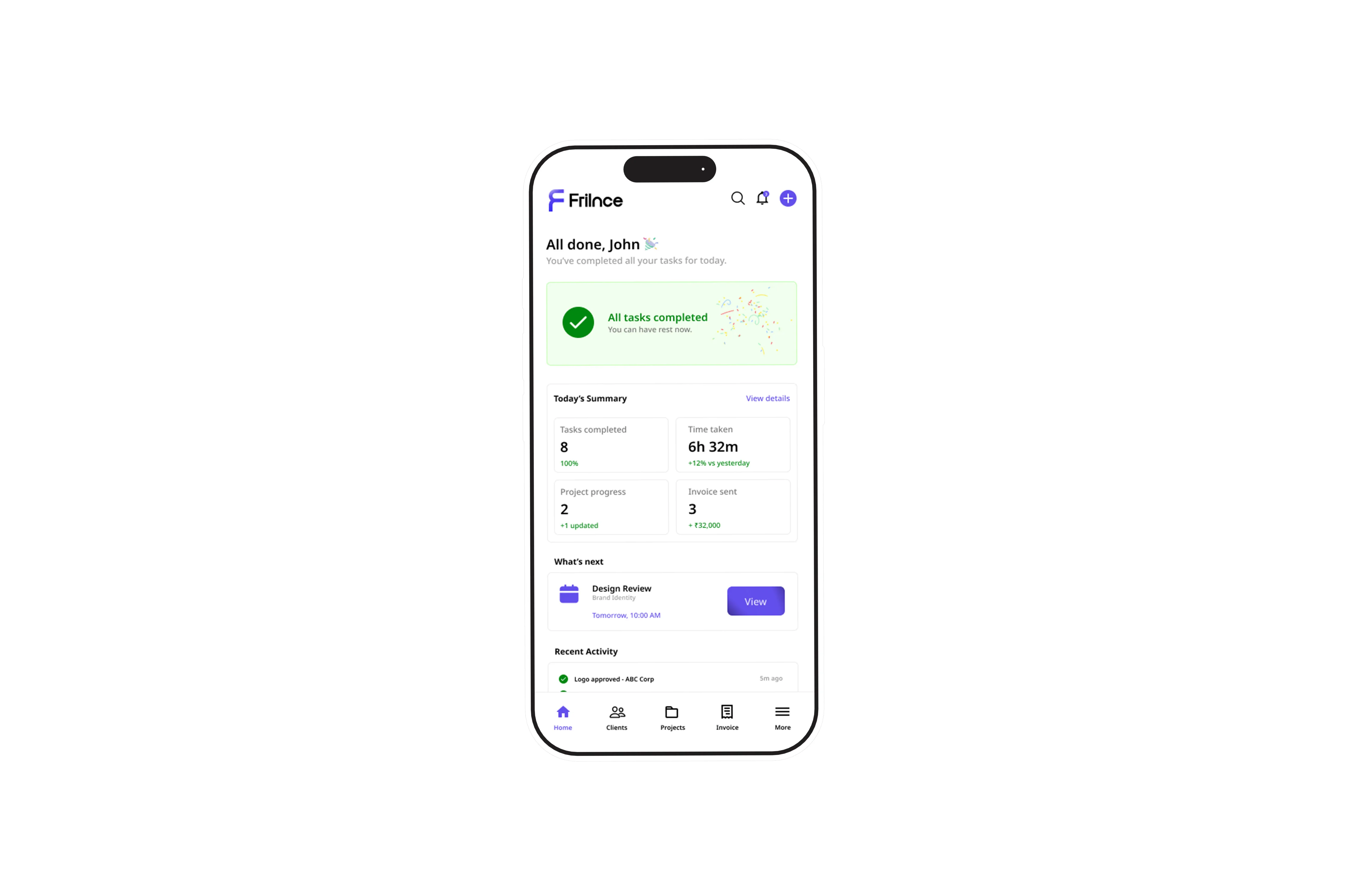
A workspace designed around a freelancer's daily workflow.
Instead of optimizing for business analytics, Frilnce focuses on helping freelancers understand what deserves their attention next.
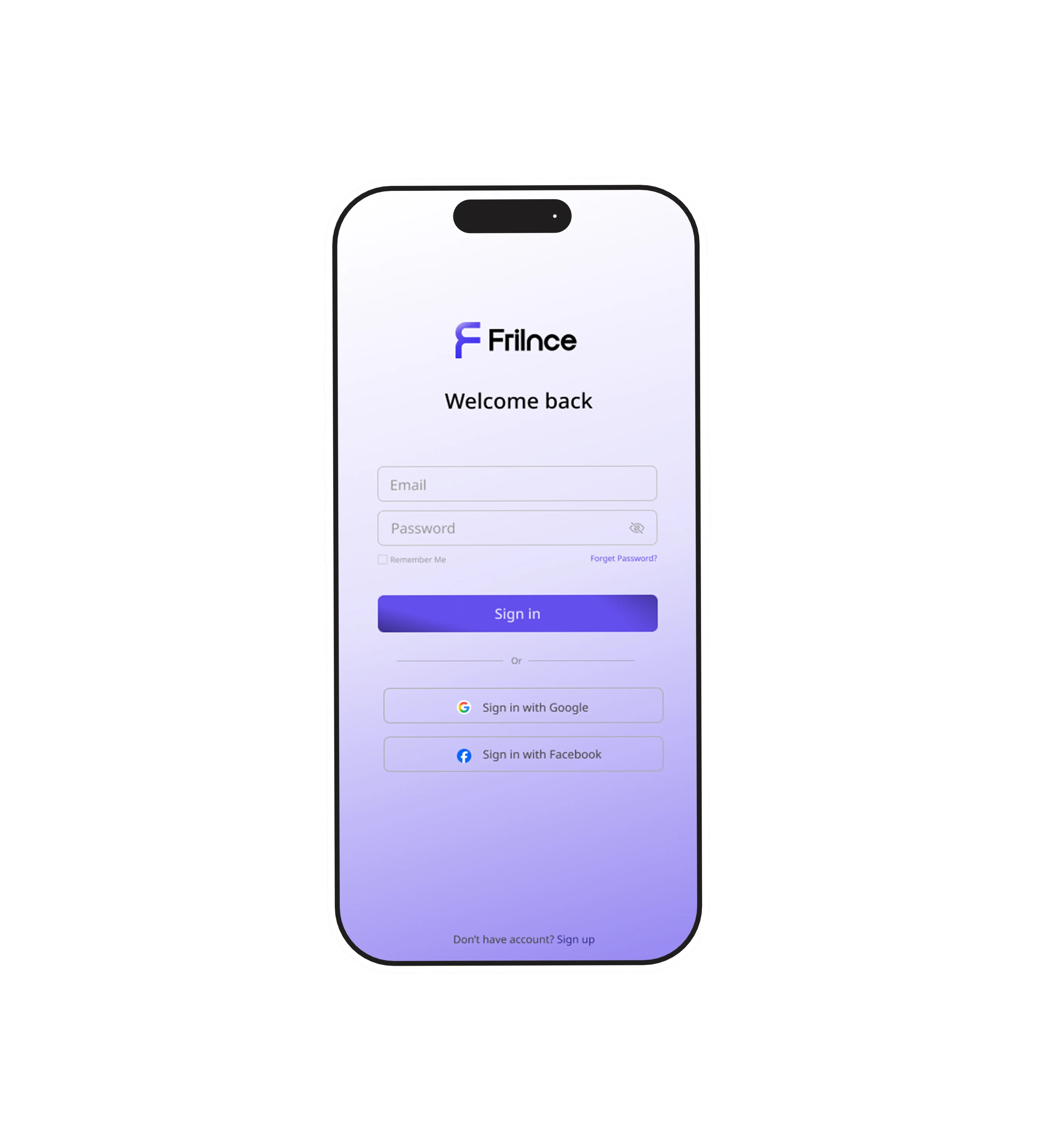
A familiar login experience.
Returning users can quickly access their workspace using email or social sign-in. The interface keeps the process simple and distraction free, helping freelancers get back to work in just a few taps.
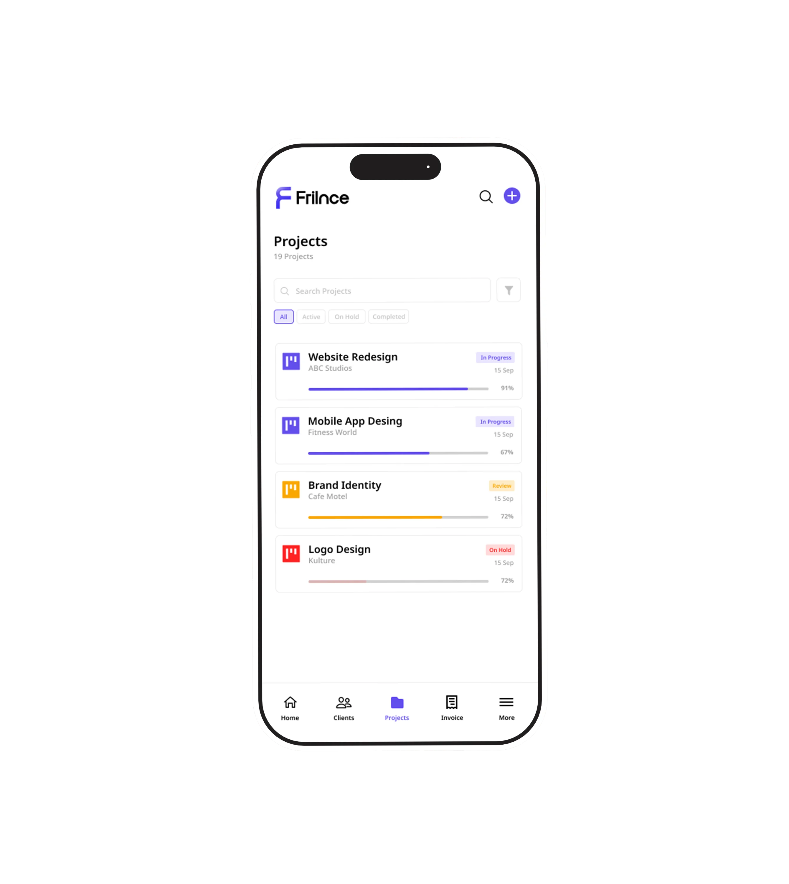
Track progress effortlessly.
Track ongoing work, monitor progress, manage deadlines and stay focused with a clear overview of every active project.
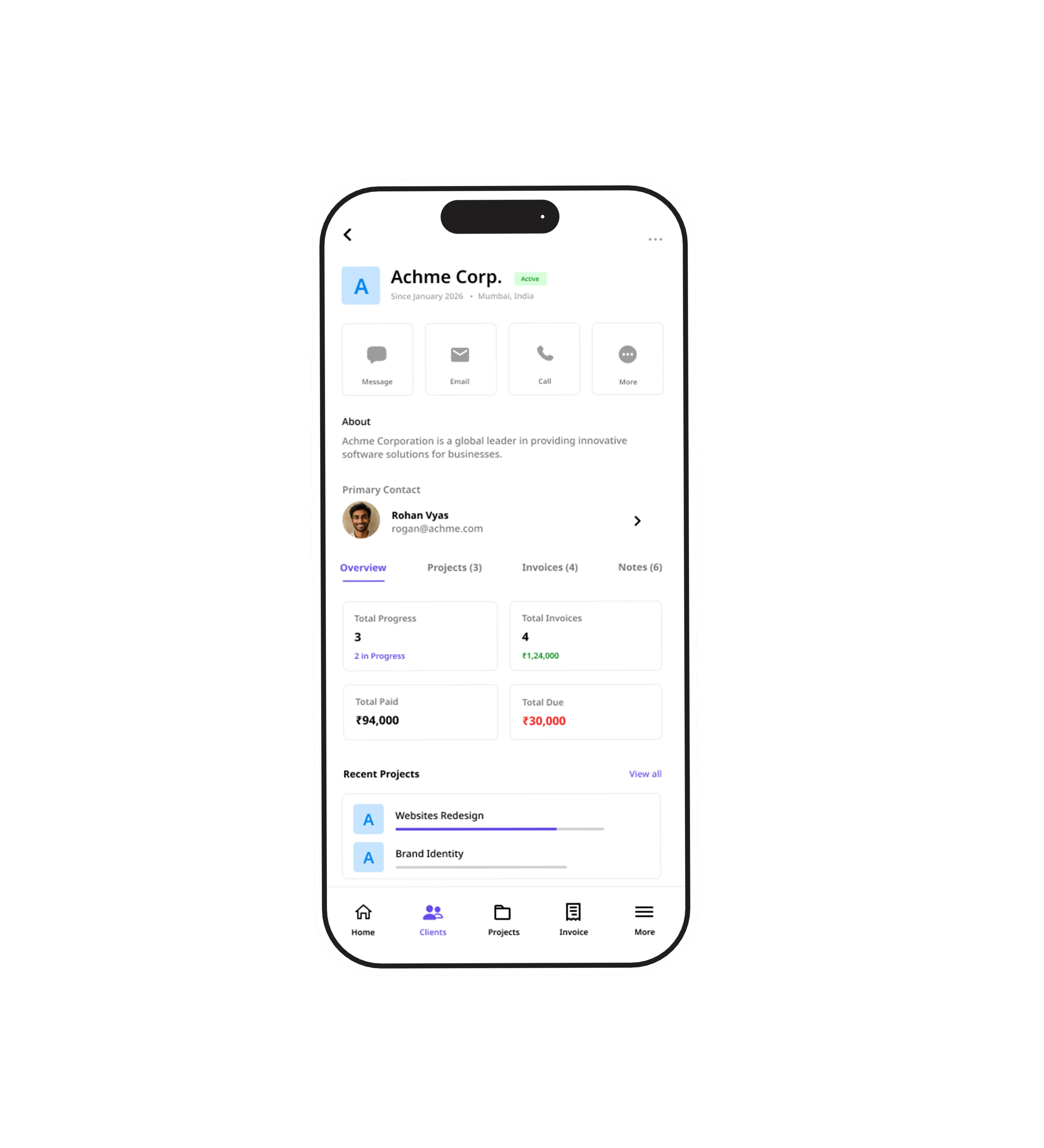
One source of truth.
Every client stores projects, files, invoices, communication and notes together.
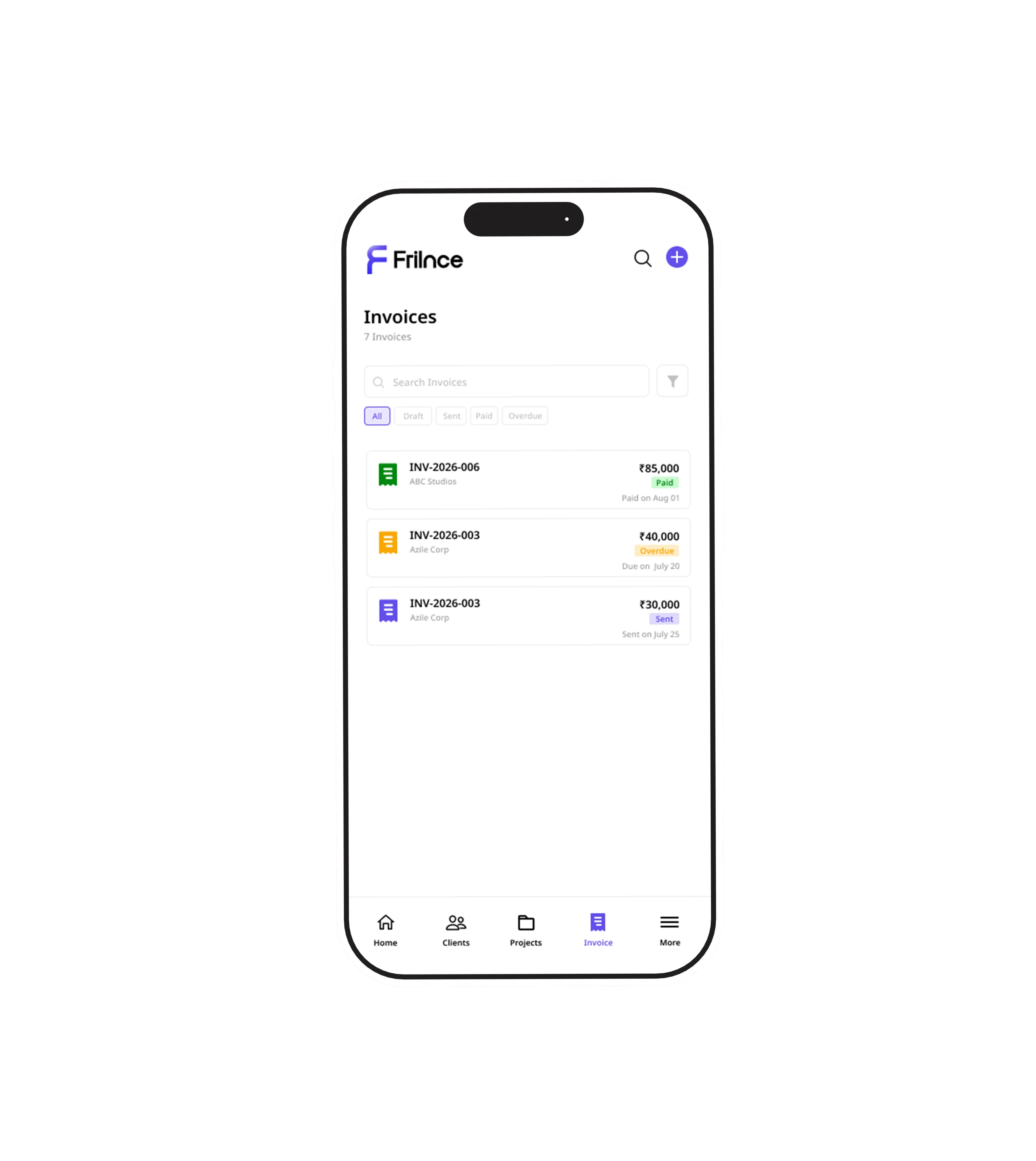
Every invoice organized.
Keep track of paid, pending and overdue invoices with a simple interface designed for freelancers and agencies.
Every screen exists to solve a specific problem.
Instead of documenting every UI choice, this section highlights the decisions that had the biggest impact on the overall experience.
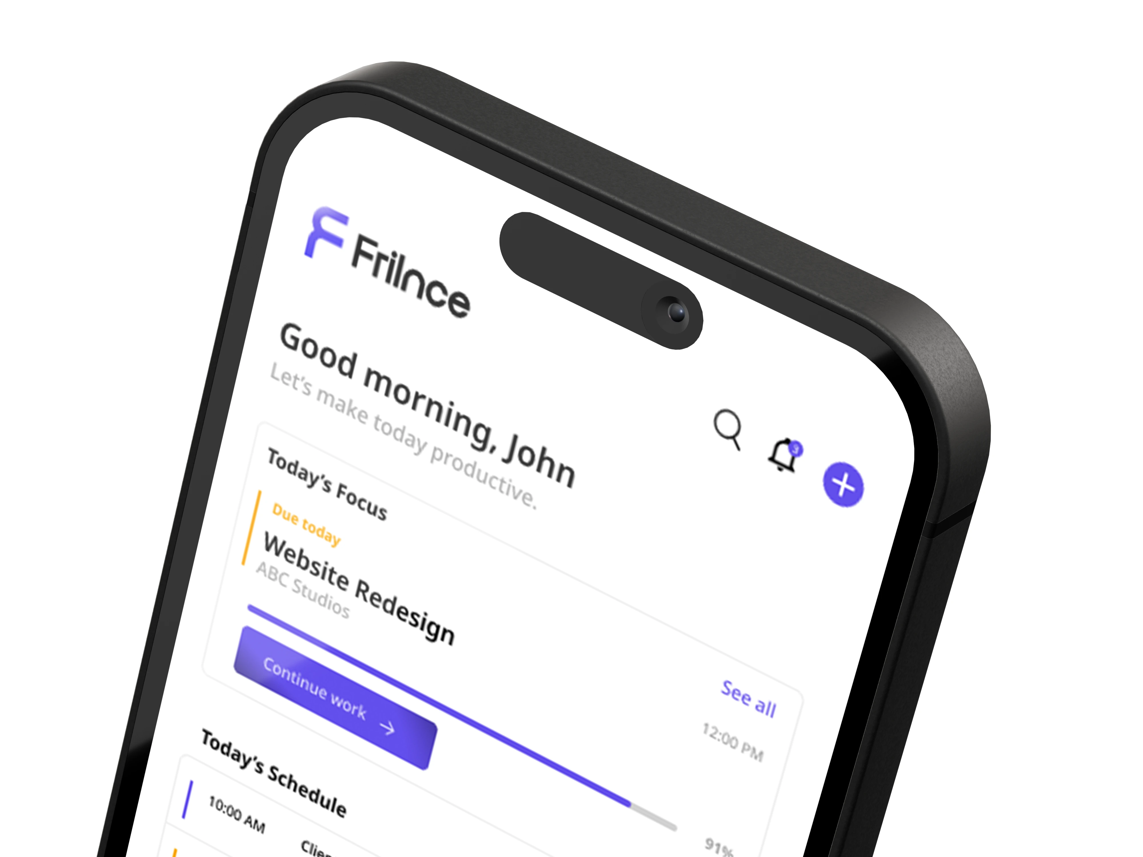 Prioritized Today's Tasks
Important Alert
Prioritized Today's Tasks
Important Alert
Dashboard
Decision
Prioritized actionable tasks instead of business analytics.
Why
Freelancers first need clarity on what deserves immediate attention, not another dashboard filled with charts.
Navigation
Decision
Limited navigation to four primary destinations.
Why
Fewer navigation choices reduce cognitive load and improve task discovery throughout the day.
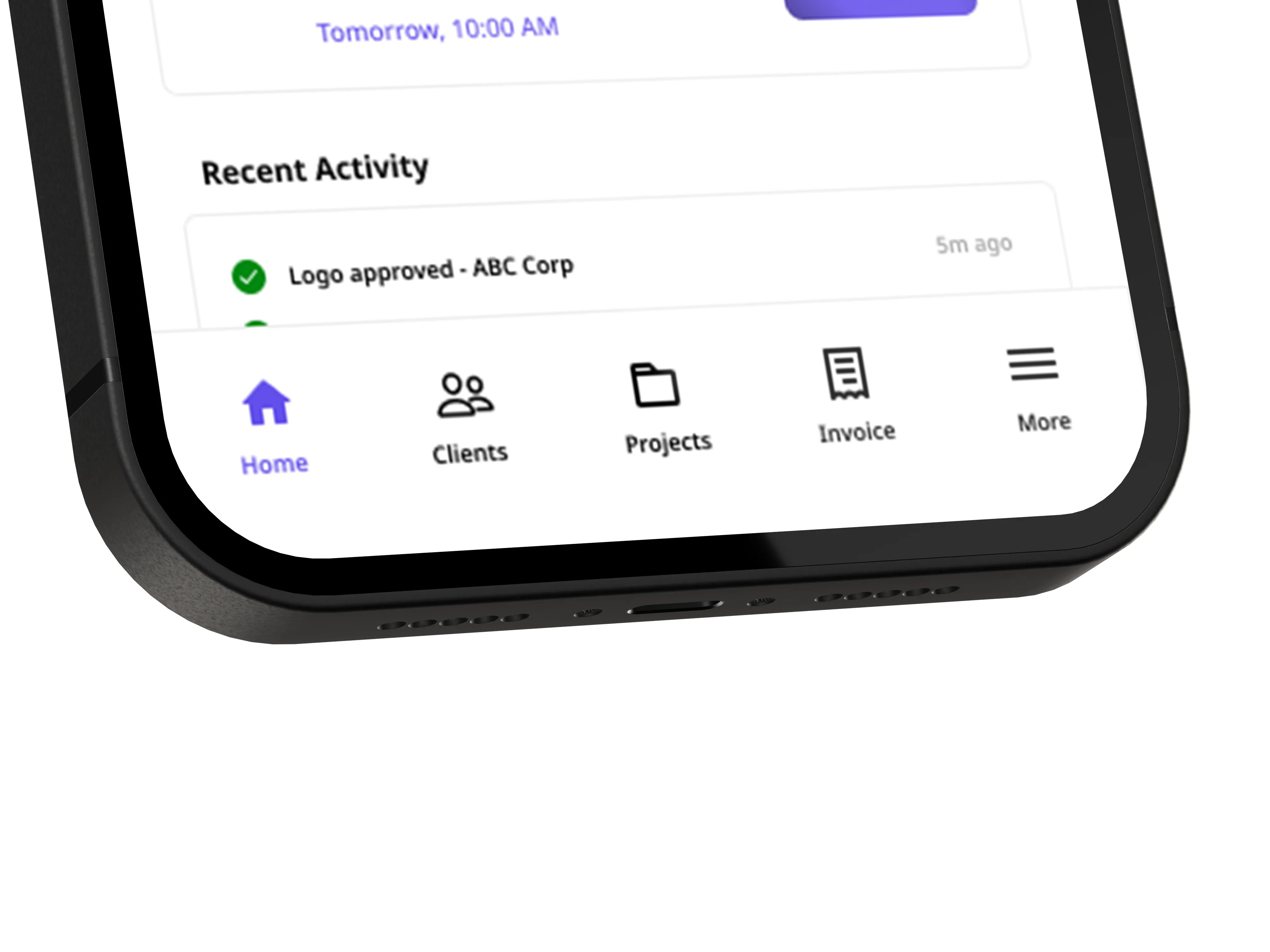 Bottom Navigation
Six weeks from research to prototype.
Rather than rushing into interfaces, the project evolved through research, exploration and iterative refinement.
Research
Industry reports, competitor audit and community discussions.
User Flows
Defined core journeys and information architecture.
Wireframes
Rapid exploration of layouts and dashboard structure.
Visual Design
Components, typography, spacing and interactions.
Prototype
High-fidelity prototype and documentation.
No engineering team
Decisions were made independently without technical validation.
No live analytics
Research relied on published data instead of product metrics.
Focused scope
Features unrelated to daily operations were intentionally excluded.
↓
Reduce Context Switching
↑
Increase Invoice Visibility
⚡
Faster Daily Planning
✓
Better User Retention
Good product design isn't about adding more features. It's about removing uncertainty.
What I learned
Designing Frilnce reinforced that successful products don't become valuable by offering more functionality. They become valuable by reducing cognitive load. Throughout the project I repeatedly removed features, simplified navigation and focused every screen around helping freelancers understand one thing: What deserves my attention right now?
If I continued this project
The next step would be validating these assumptions through interviews and usability testing with working freelancers. Insights gathered from real users would influence onboarding, dashboard prioritisation and notification behaviour before expanding the product further.