LetCoaching
Designing the brand identity and landing page experience for a SaaS platform that helps educators launch and scale their online coaching business.
↗ View Live Product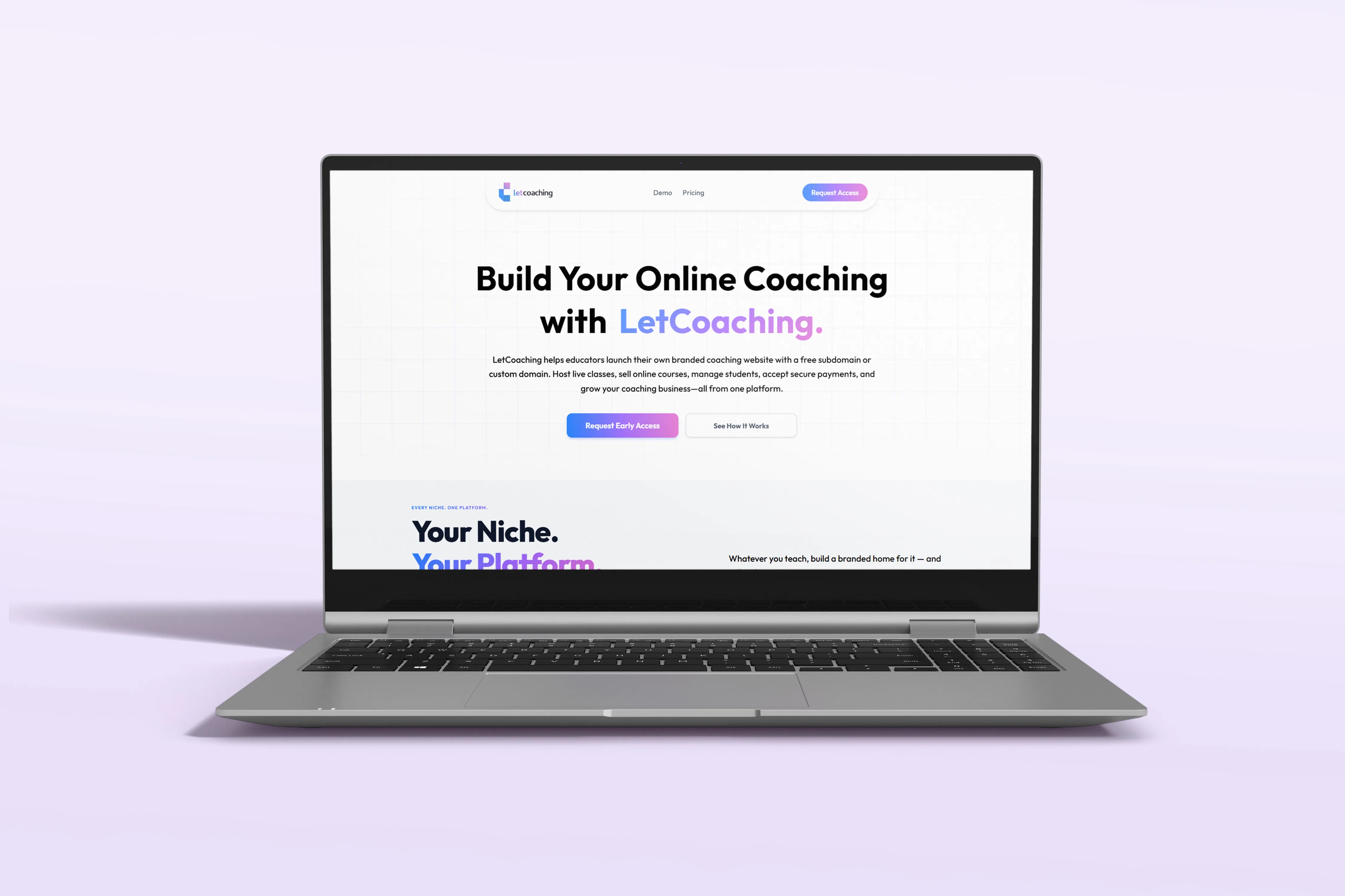
Building a visual identity that feels modern, approachable and trustworthy.
The branding combines a clean geometric logo, vibrant gradients and a flexible component system to create a recognizable identity across the entire product experience.
A simple geometric mark built from modular blocks.
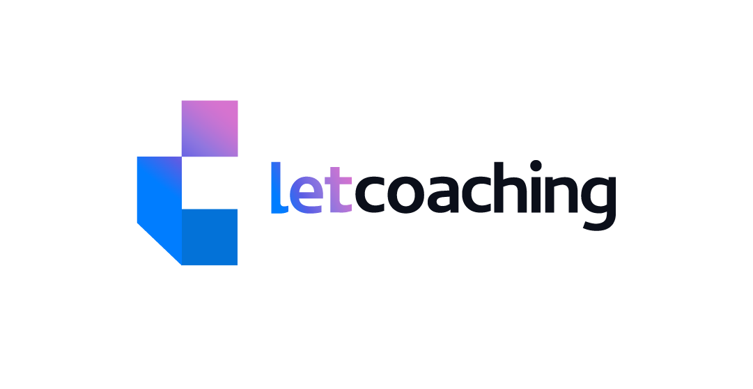

Blue communicates trust while the pink gradient adds energy and modernity.
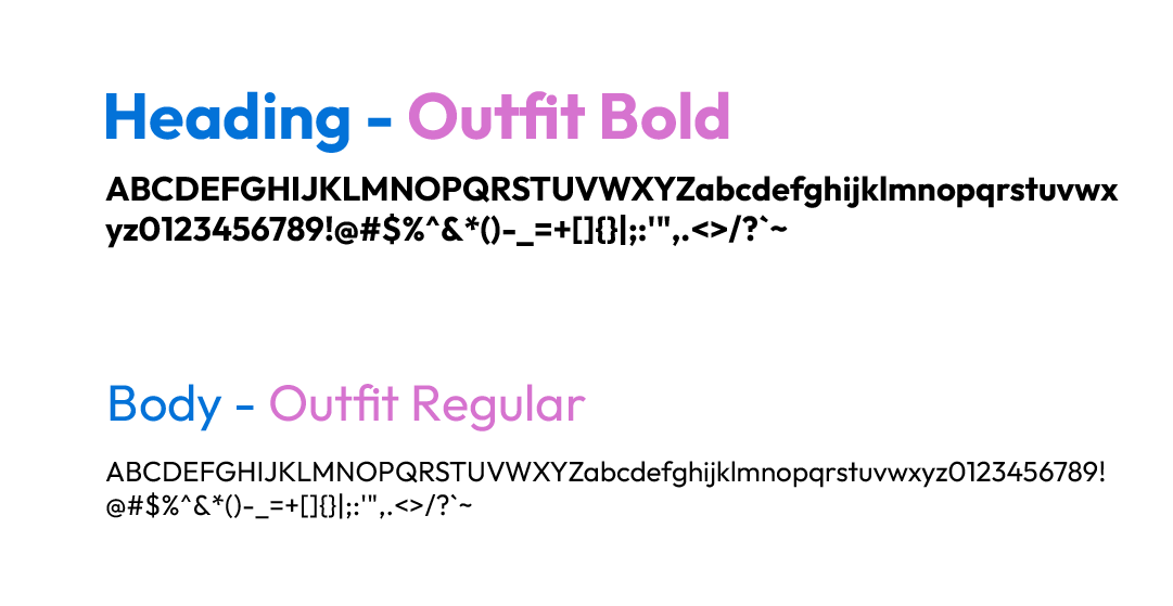
A bold display paired with clean readable body text creates strong visual hierarchy.
Understanding what educators need before trusting a new platform.
Before designing the landing page, I studied existing coaching platforms to understand how they communicate value, build trust and encourage users to sign up.
Competitor Analysis
Studied platforms like Learnyst, Graphy, Kajabi and TagMango to identify common patterns and missed opportunities.
Target Audience
Educators, coaches and creators looking for a professional platform to sell courses and manage students.
Design Goals
- Build trust immediately
- Explain the product clearly
- Increase demo requests
- Maintain a premium visual identity
Key Takeaways
- Clear messaging matters more than features.
- Trust is built through visuals and hierarchy.
- Simple navigation improves exploration.
- Strong CTAs should appear throughout the page.
Every section of the landing page has a clear purpose.
Rather than presenting features randomly, the landing page gradually builds understanding, trust and confidence before asking users to request access.
Hero
Introduce the product and establish a clear value proposition.
Categories
Show that the platform supports different coaching businesses.
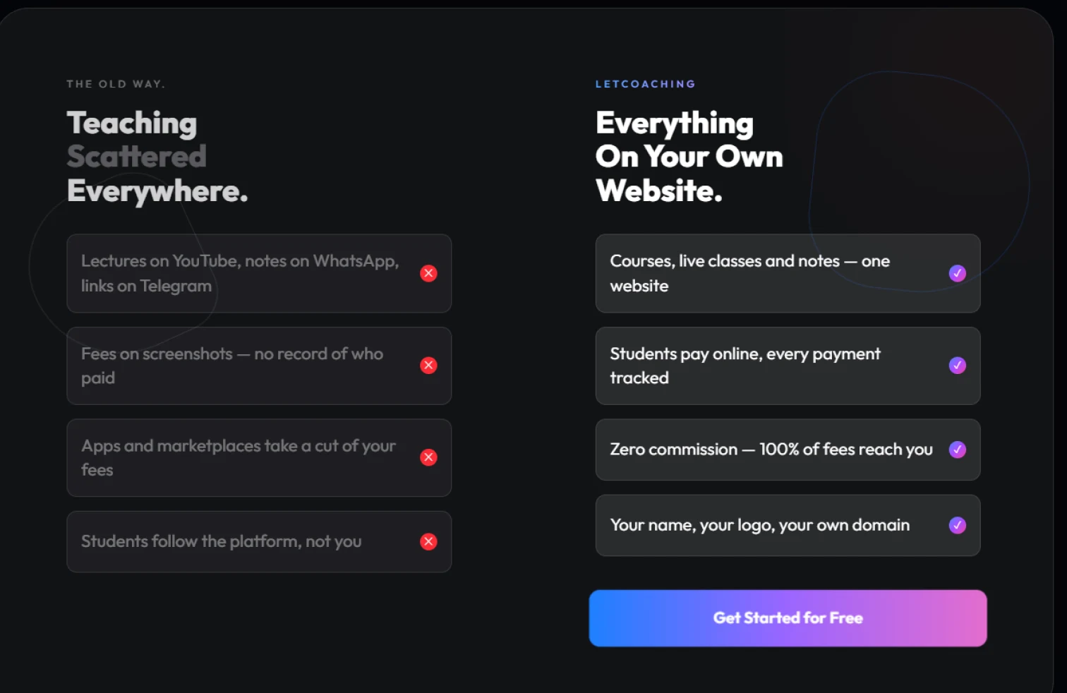
Comparison
Demonstrate how LetCoaching simplifies existing workflows.
Features
Highlight key capabilities with supporting visuals.
FAQ & CTA
Resolve concerns and encourage users to request access.
A landing experience designed to educate, build trust and encourage action.
Every section was designed with a specific purpose, gradually introducing the product, answering questions and encouraging educators to request access.
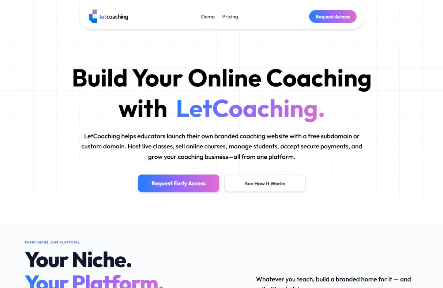
A strong first impression.
The hero immediately explains what the platform does while reinforcing trust through a clean layout, bold typography and a prominent primary CTA.
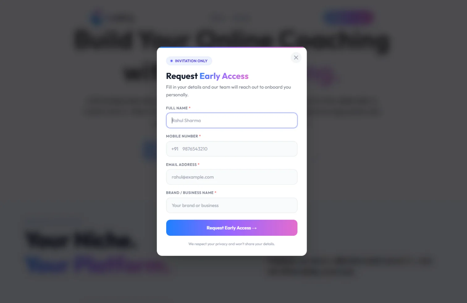
Reducing signup friction.
Instead of sending users through a long onboarding flow, the early access modal captures only the essential information needed to begin the conversation.
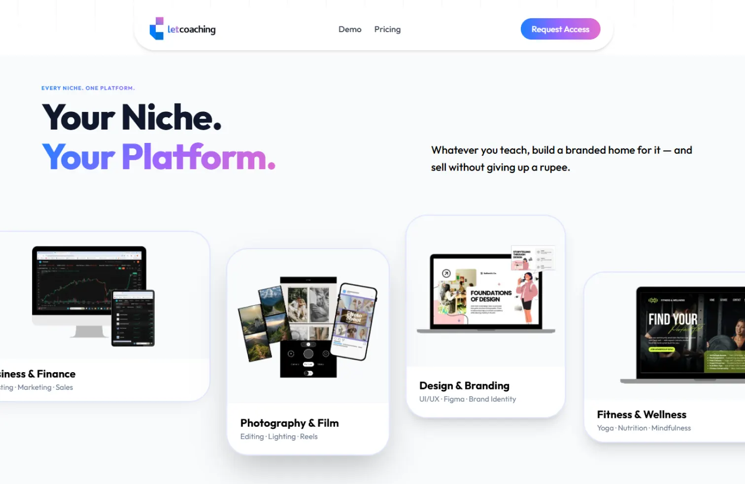
Showing the platform's flexibility.
Category cards communicate that the platform supports multiple coaching niches while helping visitors quickly identify themselves.
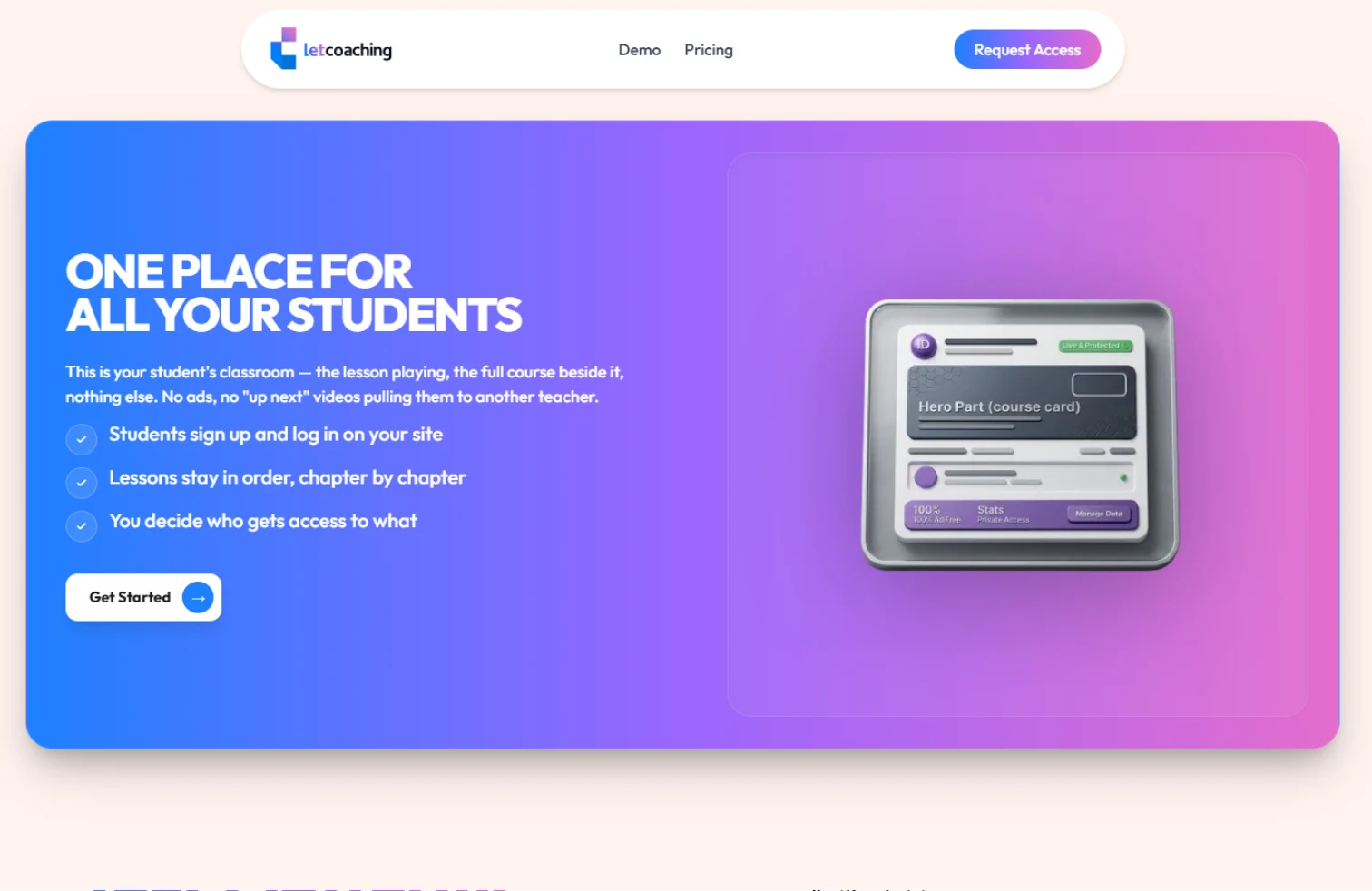
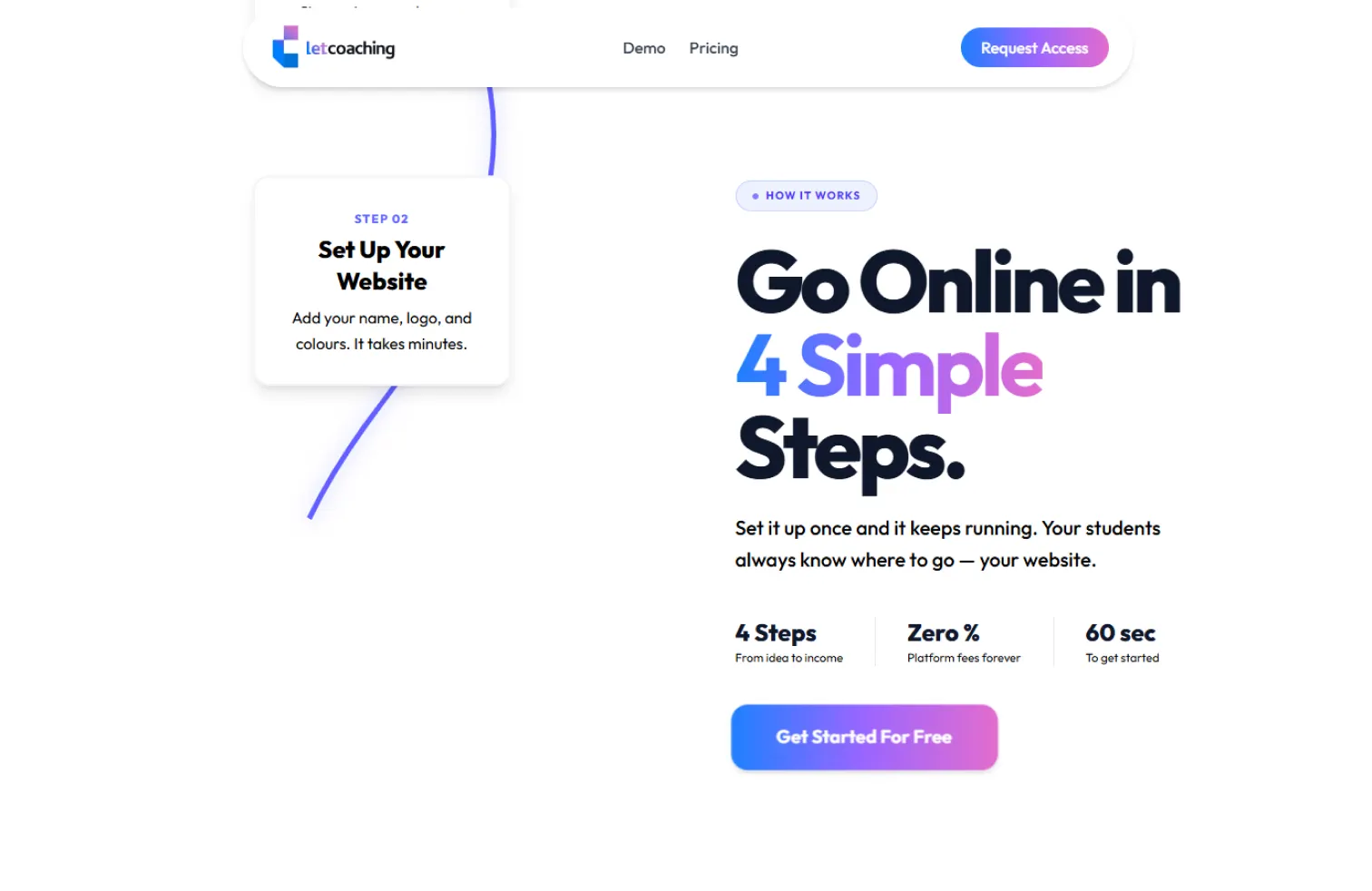
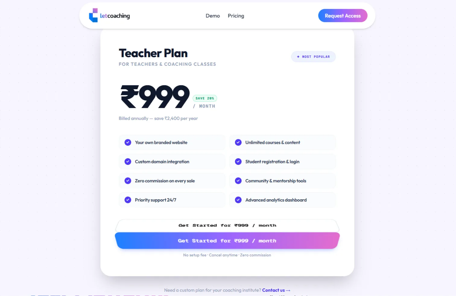
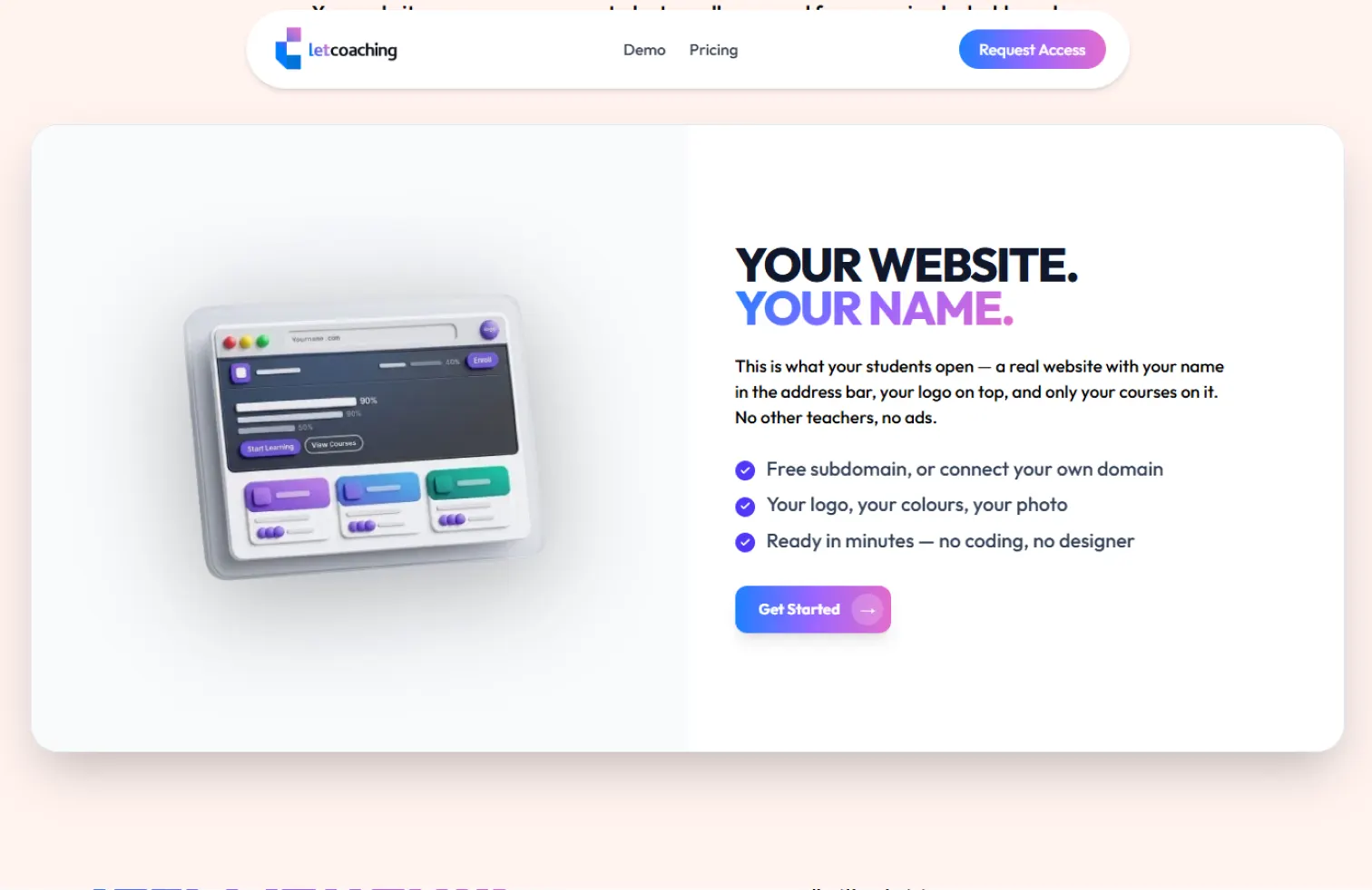
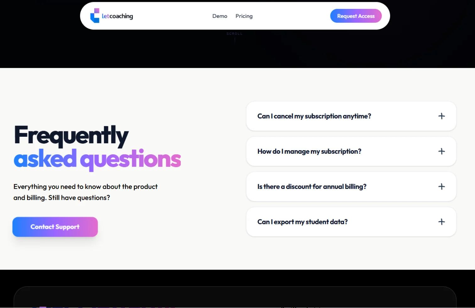
A closer look at the interface.
Every section of the landing experience was designed to communicate value while maintaining a clean and consistent visual language.
Bringing the entire experience together.
The final landing page combines branding, storytelling and product communication into a cohesive experience designed to introduce LetCoaching with clarity and confidence.